the Plausible Impossible

My Photo
Name:
Location: Los Angeles, California, United States

Rusty works in the animation industry doing Storyboards, Timing, Animation and Directing. Recently he has worked at Disney TV Animation and Universal Animation Studios. He's best known for his Directing and Producing for Warner Bros. on "Animaniacs" and "Pinky and the Brain".

Friday, September 18, 2009

yeah I know

It's been quite a while since I've posted. Lots of things have been going on. I've worked on several independent projects which have been keeping me busy. These projects have me filling almost every roll from director to animator, cleanup, and color. Thank goodness for all the capabilities software allows us to do on our own these days. I've been fortunate enough to have some projects that I could have some help on.

I also have had the great opportunity to give some animation workshops in Guadalajara, Mexico to the Batallon 52 group as they work on their animated shorts due out next year.

Saturday, November 15, 2008

Inspired Character Design

Recently I was watching various animations and looking at character work done by other artists. It inspired me into a fit of design sketching. I have often found that somewhere down the line I might need to design a character for something I'm working on so keeping sketchbooks that have these types of design sketches come in handy.
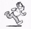
When viewing the work of others I find that I am most drawn to designs that are easy to animate. What I'm talking about are designs for full animation. Sure just about anything can be animated these days using cut-out techniques in software like Flash and ToonBoom but personally I like to do complete frame by frame hand-drawn animation and designs that work well for that technique is what I am attracted to.
I'm not always successful in all of my designs but I find that there might be part of a sketch I like and it might inspire another design. For example take this sketch of the bird. As I began doing the body I realized I didn't like it and didn't finish it. I do however like the head and could adapt it to another body. I've written before on this blog about appealing shapes and that tends to be the key to the designs I like. Sometimes I will find a shape I like and experiment using it on different characters.


Take a look at the head shape of these two characters. Though they are similar types of characters I found a shape I liked and experimented with using it on different characters. The one on the right is more extreme than the left one but both are still based upon the same shape.
Another design element I look for is difference in size of various parts of a character. That helps keep the design appealing and makes it easier to read. Extremes in size contrasts of various parts of a character is something I experiment with. Sometimes, as in the bear below, it works best to not make the parts very extreme. that often is found in the cute cuddly type of characters.


So the next time you are watching some animation you like or seeing another artist work observe their approach to using shapes and contrasts of elements.

Thursday, August 21, 2008

Keeping Busy


It's been a few month's since my last post. I was doing some guest blogging for a while but now I'm back. I've been plenty busy. The image at left is from another short clip I did for the U.S.Department of Commerce. This one they requested to be done in 3D. You can see the finished clip here It's called "Mr. Fins". But don't fret, I am not doing only 3D. Matter-o-fact I am currently doing some freelance full animation on paper for a studio here in Los Angeles and having a blast. I can't reveal what it's for but it is on some familiar characters that come from a major animated film. It is an educational short. I've been busy doing all sorts of things including some digital storyboards and of course teaching. You can find out more about what classes I'm teaching at the Studio Arts website here. I am planning on doing regular updates again here so if you are still out there keep checking back.

Tuesday, April 08, 2008

Sketching Posture

I was traveling recently and again found myself with a 2 hour layover so of course it's the perfect opportunity to pull out the ol' sketchbook and start observing people. One thing I looked for were particular postures that conveyed a personality. On the left here is a woman who needed to move past someone but as you can see she was a little hesitant for fear of how the stressed out traveler in front of her might react. I particularly liked her femininity and how she coyly asked to be excused. It's also interesting to see what many people choose to wear as they are traveling. This woman wanted to be comfortable but also wanted to accentuate her feminine attributes. Notice the slight off balance and how that helps with the attitude. Had she placed more weight on her right foot it would have given her a more aggressive attitude and lost her soft gentile manner. Even the turned in toes help.
Next there is another woman who is a little more assertive. She was standing at the ticket counter at the gate and having to get something taken care of. The legs together, leaning forward and being on her tippy toes all give a strong message about her attitude. What I like about this one is she comes across as being completely in control. You can almost see her pointing out what needs to be fixed to the airline agent. The posture has an, "I know there is something that can be done" feeling to it. I also get the notion that this woman has traveled regularly and knows the ropes. She also is dressed entirely for comfort and not for show. It's very interesting to see how different people handle similar situations. If the woman in the first sketch had been in the same situation her posture would be completely different.
UPDATE:If you haven't already visited my website go take a look at the latest updates. There is the 2008 sample reel on there now complete with a shot list. Also there are backgrounds added to the still art portfolio. Check it out at www.rustymillsanimation.com.

Tuesday, March 11, 2008

Classic in Digital


This is the pencil test for the short clip I mentioned in my previous post. My goal was to make it look and animate as much like a classic cartoon as possible. It was done entirely paperless using various digital tools.

I first did a storyboard which I created an animatic from using Toonboom Storyboard Pro. Then I did the background layouts in Mirage to have a true pencil like feel. I took those into Toonboom Digital Pro and created the rough animation which you see at the top of this post. Then I went back to Mirage to paint the backgrounds which you can see one in my previous post. I did the cleanup, Ink and Paint, and compositing in Toonboom Digital Pro. You can view the completed Fox and Bird clip in color by going to my website and looking in my current work.

Thursday, February 28, 2008

Sneek Peek

I've been working on a short piece that is done entirely paperless but is made to look like a classic old short. The background above was painted in Mirage. The animation and compositing is being done in ToonBoom Digital Pro. Soon I will have it done and will post it both here and on my site. Everything from storyboarding to the finished composited piece has been done in a traditional way though all in a digital environment. I'm using this as a way to keep up on the newest technology.
I will be teaching ToonBoom Storyboard Pro soon and this was a way to get completely up to speed with all the features. I was able to not only draw the board but create the animatic directly from my timing slugs inside SBPro. It also integrates well with ToonBoom Digital Pro so any camera moves I created in the animatic are brought directly across and I don't have to recreate them.
When it came to the background layouts and paintings I used Mirage so I could get the feel of real pencil and paint. Toonboom doesn't give real world painting capabilities and even though the pencil in TB can have a texture it doesn't give you the ability to do smudges or any other real world techniques.
Doing the animation in ToonBoom worked well since I didn't need more than a line texture to have the feel of pencil. Also having the use of an x-sheet is very nice. Below is a sample of one frame of the pencil test output from ToonBoom.

Tuesday, January 15, 2008

Traditional Drawings

Wow! two posts in less than a week! Today I am presenting some drawings I did for work to be used as a template background. I was asked if I could provide some images that look like traditional animation drawings. I first did some roughs and then decided to even clean these two up complete with fake charts, paint to lines, and reg marks.

I tried to think of characters that might feel right in some older classic cartoons. It's funny how I started drawing a blank (pun intended) when trying to think up some of these characters. Kind of like when you go to the video store and suddenly all the movies you had been thinking you wanted to see slip right out of your head.
These are two of the ones I left rough. I love doing these kind of rough drawings, getting a nice attitude and line of action. In a way this is how I do my thumbnails when I am animating a scene. Besides just getting the acting down an animator has to create pleasing drawings. That's where being a good draftsperson comes in. I find it's best to just get something down on paper than to sit there wondering what the best way is to start.
As I've gained more experience I've found that it takes fewer tries to get the result I want. All animators have their own way of approaching their work, some are rougher than others while some artist see it completely in their head before they begin to draw. I tend to fit somewhere between the two. If I can't seem to get the right pose I begin from a rougher state but often once I am used to a character my drawings become cleaner because I can see it before I draw it.