the Plausible Impossible

My Photo
Name:
Location: Los Angeles, California, United States

Rusty works in the animation industry doing Storyboards, Timing, Animation and Directing. Recently he has worked at Disney TV Animation and Universal Animation Studios. He's best known for his Directing and Producing for Warner Bros. on "Animaniacs" and "Pinky and the Brain".

Thursday, August 31, 2006

Ahh the Walk Cycle

Next to the bouncing ball, the walk cycle has to be the most rudimentary of animation assignments. Yet, with it, an animator can define their ability to create life and personality. It combines the ultimate challenge in a single animated movement. In a couple steps the animator has to show distinct personality and attitude, give the feeling of weight, and use fundamentals of animation like overlap, archs, and follow through. Sometimes the walk cycle will be a change in attitude from what you've previously seen in the character. That can be quite a challenge because now you have to make it feel like the same character yet you can't use their signature attitude. And with all this to keep track of you also have the mechanics to plot out. Generally a walk cycle is figured out by having the character walk in place which means you have to keep the steps working to a moving background so the character doesn't feel like they are sliding. Yes the ol' walk cycle does come with it's challenges but when you get it working it can give a lot of reward within a few drawings of animation.
I'm about to embark upon the scene shown above which is a turning point in my film. It is about half way through the film and leads into some of the stronger acting scenes. With this scene I have to show this guy has just about had it, yet there is quite a bit more for him to have to endure so I can't take him to far over the top.
So if you are looking for something to animate that can show your skills or help develop your skills as an animator try doing a walk cycle.

Wednesday, August 30, 2006

Unique to Yourself

Often I see scenes that make me say, "ahh they looked at Milt Kahl's animation or Chuck Jones design, or Frank and Ollie's work". Although this is the best way to learn there does come a point where you realize it wasn't though out from a true acting standpoint. Though all of the master animators who came before us should be studied I offer up a new idea on the subject. Rather than directly follow how they acted their characters or actions they derived I suggest building your own style based upon your own observations.
When I was at CalArts the first thing the teachers had us do in animation was to inbetween some classic Disney scenes. For the least experienced of us it was a lost lesson. Those scenes really only helped me later in my studies there when I could truly understand what the animator was doing. What it did do was give you a great big boost of confidence. Because no matter how crappy your inbetweens were the scenes always looked gorgeous simply because the animator had but so much there already.
My point here is you need to make your work unique. All these master animators did that. And I can hear you now saying, "well yeah, they were the masters". Ahh but they weren't always the masters and though they did follow some masters of their own, they built new ways of creating their animation. Even though they each have specific styles to their work they approached each new character and sequence with a uniqueness that shows in the final work. To do this they got up and acted it out. They looked in the mirror. Observed their friends and families. And yes, they had their own frustrations. Most of them would admit feeling like they couldn't get something right, or the character was so boring they had a hard time thinking of some interesting way to make them act.
So if there is any cue you should take from these masters it's do you own acting and observing and bring something new to the table.

Thursday, August 24, 2006

A Small Painting

Today I thought I'd break away from animation and share some more of my "plein air" painting with you. This painting I did a few months ago while there was still some green in the hills around here. The day was great because it was somewhat overcast and so I was able to get some good atmosphere in it. I also used the opportunity to exercise painting small with a large brush. I've always been fascinated by paintings that when viewed at a distance have greater detail than when viewed up close. The only way to achieve this is to paint with a large brush and larger strokes. This painting is only 7"x12" and most of it if you look close is not very detailed but from a distance it all falls into place.

Tuesday, August 22, 2006

The Start of Design

Whenever you begin a project the design has to start somewhere. For me it is usually the characters that start the design then the environment. I have worked in many different styles and like to pattern the design of a film or series around several different criteria. These are:
Animation
Budget
Genre
Medium
By animation I mean, full animation, or limited animation. I prefer to make the type of animation part of the style of the show/film rather than the cost. That brings me to budget, if you know where the project is going to be done (i.e. what studio) you can probably get a good idea of the types of budgets they will give to the project based upon their previous work.So there's no reason to design a high budget film/show and squeeze it into a low budget. When I was on "Animaniacs" and "Pinky and the Brain" the accountants would always want to cut the budget down to half. I would tell them that if they still wanted it to be the same show it would work. Instead of having the show come in closer to budget it would be over budget. Instead I would offer to design a different show that would fit their budget.Genre refers to your audience. The design should feel friendly to them. Some what familiar but with a twist. Take a look at films/shows that fit
your target audience. What are they used to seeing? This doesn't mean you can't take your design in a new direction but your audience must be able to relate to it in some way. Often these days I see shows that seem to think characters with very little expression or even ugly designs give it a "fresh" new look. I also see shows that leave out all fundamental elements of design. This can make for compositions that are too busy and make it hard on an audience to follow. Especially if you happen to be designing a show for Pre-schoolers.Finally be aware of the medium. Is it going to be animated in Flash? Perhaps it's going to be done in 3D. Whatever the medium it's going to be done in it's a good idea to designing with that in mind. Make that part or your decision on how the characters are styled. And it certainly will have an impact on the environment. Certain textures might be available to you when working in a particular medium and others might not be.
All of these need to be considered when designing. They all impact each other and in many cases are good items to know when pitching a project. You might get asked about the genre and the budget and even the medium.
I have spotted this post with various designs I have done but either the pitch didn't get picked up or I never used them.

Friday, August 18, 2006

Why Design?

The style of your film or project can make all the difference in the world. Here's a concept; how about let the film dictate the design! To often I see projects being done that are the same design as the previous project done by that studio or person. I've always felt a film should be a total artistic experience. From the composition on screen to the color to the characters. Right now the film I'm working on has an old Disney / Warner Bros. feel to it and it fits the story. My next film I plan on having a very different style. Sometimes combining styles can give an interesting approach to the film. Take the illustration I did above. It combines a flat style on the character with a textured painterly style on the background. One thing to always keep in mind though is to not let the design overwhelm the story. I've seen plenty of films that make me say..."It looked nice but not much of a story".

Thursday, August 17, 2006

Perfect Timing pt. 2

Here is a list of my key timing antidotes:

1. Anticipation
2. Contrast in Action / Timing
3. Slow-in / Slow-out
4. Overlapping Action
5. Arch & Linear Action
6. Dialog Timing
7. Expression Timing
8. Tension

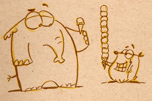
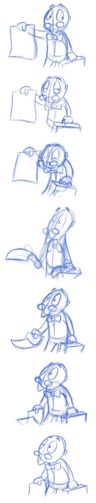
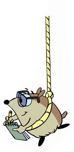
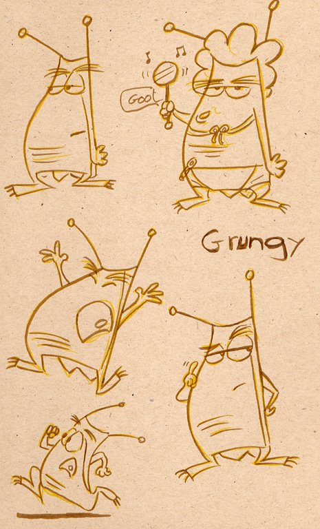
I have chosen the scene at the left here to illustrate many of these key timing principles. This animation is a simple reaction to something happening behind him. The animation for the most part is on 2's accept for the actual stretched take which is on 1's. This is another principal I have; use both 1's and 2's were needed. I do not use 1's just to smooth out the animation but rather to enhance particular actions. So here is an explanation of each of the items on the list.
Anticipation
Generally whenever a character is going to move they either need to anticipate the action or slow into it. In the case of this scene you can see the extreme of the anticipation by the 3rd drawing. Though this is more extreme than in real life you can see these type of anticipations throughout the day in movements people and animals make. The amount of anticipation depends upon how extreme the action will be and what your character is like. More realistic characters use less anticipation than cartoony ones.
Contrast in Action / Timing
This is when you vary the speed of actions to help give interest to the animation. If the timing is always even then it will be boring. A character runs fast towards a street corner then skids on one foot as they turn the corner. Giving the character more time in the skid will give the feeling that they were running so fast that the momentum almost didn't let them get around the corner.
Slow-in / Slow-out
Using this ease into an action can sometimes take the place of anticipation. It is also used to cushion an action as it comes to a stop. I've often heard animators refer to a character hitting a wall when there's not enough cushion at the end of an action. In other words the action ends too abruptly. I even use this in anticipations sometimes. In the scene here you can see the slow-out at the end as he comes to a stop in his pose.
Overlapping Action
Notice the action of the hand holding the paper. It follows behind the main action and the paper follows behind the hand even more. This is overlapping action and helps keep the the characters alive. It's also where you might overextend and settle back into a pose as is the case in this overall take...He goes out to the extreme then comes back down into the final pose.
Arch and Linear Action
Most actions move in a natural arch. If you follow the motion of the characters head here up into the take you will see it arches down into the anticipation and up into the take. Even the hand move in an arch. Linear action is usually used on inanimate objects but there are times when using it on a character can be useful.
Dialog Timing
If you have dialog use the accents in the reading to give your characters accents in their movement. You have to be careful not to over do it though so pick out the major accents. Also a quick tip...If a character is going to open their mouth wide for dialog it is usually best to pop it open wide and settle it back down. This helps give punch to the dialog. Try to give head movements that match the dialog such as moving the head up when the mouth is opening wide. Most of all beware of flapping mouths(i.e. open, close, open, close..etc).
Expression Timing
There's no better way to give a character personality than to change their expression. How fast you change it can also give a feeling of their personality and/or emotion. Think of the slow burn. If you did that same action much faster you'd get the idea the character is ready for attack. A child's eyes slowly welling up with tears in contrast to a quick blast with tears flying out. Sometimes just giving a beat of time on an expression will give your audience an idea of how a character is feeling or what they are thinking.
Tension
Slowly moving towards a closed door can give great tension if your story has placed a character into an unknown environment. Frantic movement around a room can also give tension when contrasted with another character standing still. In "All the Cat's Join In" there is a great scene where kids in a car are speeding along and the suddenly slow down and drive by a policeman then speed up again. The contrast in the timing gives tension while they pass the officer.

So keep these in mind when you are animating. It doesn't matter if you are doing 2D or 3D, these same principals apply. Always be sure it is you making the decisions about the timing and not the computer.
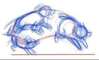
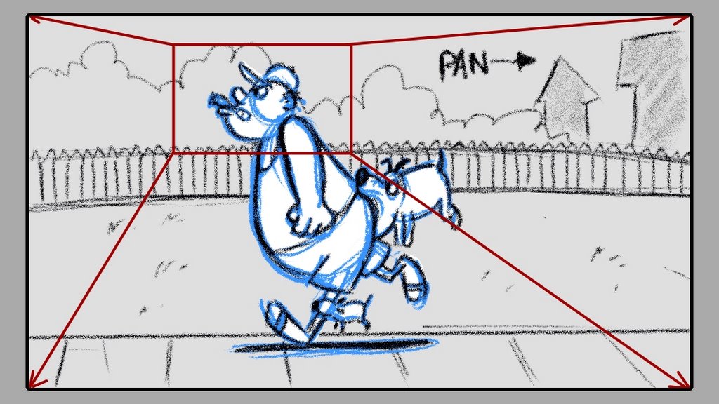
Wednesday, August 16, 2006

Perfect Timing pt. 1

Last year I was one of several guest artists for 2 weeks at the Summer Arts festival held at Fresno State Univ. The animation students completed three short films, two in 3D and one of which was 2D that I directed called "Bass Akwards". The image above is the simple model sheet we used for the main character. These students were new to animation but did an amazing job on their films. While there I gave a lecture to the students about timing. So here is that the first part of that lecture.

Animation Timing
Most new animators always ask the question, "How do I know where to put the next pose or keyframe and how many frames apart they should be"? My answer to them is "you don't", until you have either experienced, observed, or experimented. Timing has the ability to create tension, humor, surprise, emotion, escentially it gives the sense of life. Without timing there would be no tension in the opening of "Raiders of the Lost Ark", Wiley Coyote falling off the cliff might be gruesome instead of funny and the scenes you animate might not read.
As a Producer and Director I spent a lot of time in editing retiming the animation by cutting out frames or adding frames. You don't want your director to have to retime your scenes in editing so take your chance now to get it right.

So back to the original question, "How do I know where to put the next pose or keyframe and how many frames apart they should be"? Use a stopwatch, act it out, have someone else act it out, sketch! observe! I always hear complaints about sitting behind a computer for hours. Get up, act it out create some video reference of your self or others. Discuss your scene with other animators, get their thoughts on your approach. If you truly feel it won't fit into the time allotted talk it over with the director or your supervising animator. Often you will find your approach is wrong. But sometimes you will find the director will open up the time for you.
You must be sure the timing you are putting on the character(s) you are animating matches the timing throughout the film. This doesn't mean they can't suddenly change due to circumstances in the story but it still needs to feel right to the character. That is how a character maintains their personality. Think of the timing of a walk and run on a particular character. Had it been different it would change the personality of the character.

Tomorrow I will continue with my notes from my timing lecture.

Tuesday, August 15, 2006

Getting in the Groove

As I continue to get into the freelance groove I will share with you two items. First this drawing of a Parrot named Socrates who was one of the characters for a show I pitched together with a couple writers (Charlie Howell and Grant Moran) while still at Warner Bros. The show was about 3 animals, a cat, a dog, and a bird, who were left abandoned at their home when the owners were abducted by aliens. They had to make it seem like humans still lived there to keep from being taken by animal control.
I had wanted to have this brush pen style to give it a unique look. But alas the show was not picked up. The Backgrounds had a nice textured style to them. I will put those in a later post I have planned about background painting.

The second thing to share goes along with the post about animating groups as a single shape. It was requested that I share the animation with the dogs overlaid on top of the shape to further illustrate the method. Remember that these dogs appear in silhouette in the final scene. They also move across the scene and are much smaller in the frame. Often I find that if I animated a cycle larger then reduce it down for the final scene it will have a better feel. Today it's much easier to do this in the digital medium.
Click here to view the animation

Monday, August 14, 2006

On the Move

I have finished my work for Disney TV Animation and am moving over to do freelance timing for Universal Animation Studio. I will be working out of my home for now until I am called back to Disney later this year. I've been getting myself settled in. Whenever you leave one company for another you have to switch gears and get into the new groove. Especially when it's making the transition from studio to home. So I apologize for the lack of posting for the past couple of days. I will be continuing my posts about my film tomorrow.

Thursday, August 10, 2006

Everyone Gather Together in a Group

Frank and Ollie write about animating groups of characters as a shape in their "Disney Animation: the Illusion of Life" book. This technique helps keep a uniformity to the characters even if the action is more sporadic. In the scene I'm working on I have a group of dogs who chase one of the characters. The dogs are also going to be in silhouette which makes it even more difficult to read them as dogs. So I go to the technique the experts have given us. This involves animating a shape first, then conforming the characters to that shape. I used a bean shape which has a movement similar to a single dog running. Giving it this type of action will help sell the fact that they are dogs. Together with the sound of barking keeps me from having to be sure the silhouettes read in every frame. It also helps get the overall timing of the action because when you have characters of different size and shape they tend to run at different paces and that can impede the group moving together.
After animating the shape I placed the three dogs into the shape. Not only will it make them move together more smoothly but it allows me to make more pleasing overall poses. Had I Just animated the characters singly I know I would have made the timing of each much slower. Using this technique I am able to make more comical timing. The same could have been true if I needed it to be more dramatic. Simply by adjusting the timing and design of the shape. Notice how the shape is simply a guide. I don't have to be exact in matching the dogs to the shape.

Tuesday, August 08, 2006

Bad Animation is OK

First off there are different types of bad animation. The closest to hand is the animation you yourself create that isn't working. You know that scene, that no matter how hard you work on it there doesn't seem to be a solution that will make it work. Then there's the "quick and cheap" animation we see a lot of on TV and the internet. And finally there are those animated films that have everyone asking the question, "why did that ever get made?"
Well, I made a TV pilot that falls into the last category making those who have watched it wondering why it ever got made. In this case it was killed by the writer and the executives who accepted his script. The designs here are what the show was built around. These are what got it optioned, yet the writer decided he couldn't understand why there wasn't a "floor" in the image inside the tea shop. So the style got lost to more conventional walls, floors and ceilings. This series was also designed to use limited animation yet it was written dialog heavy which in my opinion doesn't work when you already have characters that aren't going to move too much.
So back to the subject of this entry. Why would it be okay to have this bad animation around? It's my philosophy that without it there would be nothing to let the good animation shine. We have to get the bad out of the way. I look at every experience I have in this industry as furthering my animation education. Sure I've worked on some of the worst dreck that's ever been produced but it taught me what not to do. For myself I always do my best on any job I work on. When I watch a film that has me questioning why it was made I look at what's not working. As much as we need to study the good films we should also study the bad. Understand it so you don't make those mistakes.
Look at the "quick and cheap" shows and find why it's not working. Doing animation for a small budget doesn't mean you have to reduce your standards. It means you need to design for that budget. Think about who you might be pitching a show to. If it's going to be done for a small budget then design it that way.
In your own work don't despair when it's not turning out how you want it to. Take a breather and come back to it. Sometimes discard it and start over using a different approach. Now that you've gotten the bad out of the way then you know what not to do and can change it.

Monday, August 07, 2006

That's a Fine Silhouette

Silhouette is something you hear talked about a lot in animation circles. Many times how it applies to animation gets misinterpreted. Often animators think it means to be sure arms and legs need to be put out to the side in order to get a good silhouette. I call this a “flat” silhouette. Although that does work and should be looked for it can become boring and can cause your animation to lose it’s dimensionality. To get a good silhouette might mean you need to utilize certain aspects of your characters design. For example if they have a large torso area, placing the hand in front of that area could make it easy to read.
It is most important to have good silhouette in your final pose of an action. This means that the inbetween poses might be weaker in their silhouette but as long as the over all action can be read this is okay.
Another area animators tend to forget is to not only make sure the overall pose works in silhouette but individual parts of the character need to read. Hands, arms, legs, feet, heads, etc need to have good silhouette on their own.
I am starting a new scene on my film that is the ultimate type of silhouette. In this scene the characters are solid color so the action needs to read well. In these types of cases it is often good to blatantly pose the characters in a flat silhouette.
When storyboarding a film you need to be careful when planning these types of scenes so by the time they get to animation the action isn’t going to get lost. Certain cheats can be used in cases like this. For example in my scene I have gotten rid of all extraneous objects around the house in the background. If you use silhouettes in a shadowy setting, place a solid area of color behind where the character will be to help them read. Perhaps a pool of light or a solid wall.

Friday, August 04, 2006

Direct Yourself

One of the most difficult things when animating your own film is being your own director. There is always a tendency to let the scene go as it is. It's amazing how easy it is to overlook the flaws when you don't feel like redoing any part of a scene. Of course I can also be pretty brutal to myself and over criticize the work. There has to be a happy medium, otherwise the project will drag on and I'll face the possibility of never getting it done.
I'm fortunate enough that I have been a director with a budget and a schedule. This has given me a nice balance between getting it done and making a quality film. So I switch hats and look at my scenes with that directors eye. What instructions would I give that animator? Simplify the action; Punch up the dialog to match the track; Stronger poses where needed; Slow down or speed up the action; Give a breather in the action; Eye direction; etc. These are all directions I might give to an animator so I look at my own animation in the same way. When I do it gets better and I feel like I'm getting the quality I want.

Thursday, August 03, 2006

Tilt! Tilt! Tilt! Tilt!

It's amazing how the smallest things can sometimes have the biggest impact on a scene. Years ago I learned about using head tilts. Tilting a characters head either up, down, or to the side helps clarify the attitude and expression.
Using head tilts together with a strong body gesture will strengthen your animation. Always consider 3D space when using a head tilt. Look at the drawings I've included with this post. The head is often tilted in a combination of directions. Using the same drawing and simply angling it up or down is not a true representation of expression. It's only action so a character doesn't freeze.
Take a look at the difference between the upper poses and lower poses in this drawing on the left. See how changing the tilt in 3D space makes a difference even though the expression has stayed the same. Sure the upper poses can work in many situations but look at how much more the lower set accents the look simply by giving the head a tilt in 3D space. Granted my character designs lend themselves to work in 3D space but often I find people making stylized cartoons take the lazy route of saying "well my cartoon style is flat". To me this is just a lack of trying. Even the stylized cartoons of UPA and Disney used head tilts. Experiment with your characters and see how you can make them expressive while still fitting into the design of the film. Sometimes a head tilt can become part of the style of your film.

Wednesday, August 02, 2006

Past and Future

In this day and age of new media, 3D animation and digital 2D animation we must always look back to the past and obtain knowledge then apply it to our chosen medium. With programs like Mirage, Photoshop, Painter and others being used to create digital backgrounds it's nice to look back at artwork created by the traditional mediums. Here is a painting done by Annie Guenther when she worked on my crew at Warner Bros. This painting was originally painted for the Tiny Toons Halloween special but due to my fault it needed to be redone to make the time of day as midnight. Annie being the great person she is said no problem then went off and did a new painting. These days those type of changes can be handles much easier without having to repaint. I was able to later use it for the opening titles of the Pinky and the Brain Halloween special. Looking back at work like this or some of the classic Disney and Warner Bros. and UPA films can help keep that life that is often missing in newer animation. There is still high style and design in these works and one hurdle I often have a hard time getting over when viewing newer work is the design. It often overwhelms the viewer to the point that it's difficult to follow. There is always room to experiment and I love see something new and different but not when I get bored due to lack of restraint. All of these Studios as well as others tried new styles and mediums from limited animation to stop motion. One thing we can learn from their work is how they animated high style designs without losing the style but still keeping the motion clear.
I'll share with you drawing I did when we were looking to create parents and possible other relatives of Pinky and Brain. This is what eventually became Pinky's father. The little guy though cute was never used because the style didn't match the show. Besides a script never got written that included relatives other than his mom and dad. I keep a file of all this artwork along with copies of old Disney and Warner Bros. animation for reference. Sometimes even some of your old artwork can be inspiring.

Tuesday, August 01, 2006

Shapes for Another Day

I've mentioned before that I often sketch out ideas that perhaps I'll use on another day. Here is a character design I had done with a writer for a series idea. We did do a couple of pitches for it but nothing came of those pitches. I felt the concept needed more work before it would ever be pitched again. The image here is a refined design from when we did the original pitches. I often find that ideas like this will pop up in other designs or stories I do. It even shows up in my animation sometimes.
When I was at CalArts I had a design teacher named Bill Moore. While I was struggling through the first semester of his class, like most of the other students, I found myself wondering exactly how this pertained to animation. Once I started grasping his design concepts I could see that it would be used for character and background design and color. It wasn't until I was in my second year with him that I began to see that it also should be used in the poses and action I put into my animation.
Strong shapes and design help make the action read well and give the audience a visual feast.