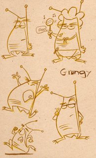
Shapes for Another Day
 I've mentioned before that I often sketch out ideas that perhaps I'll use on another day. Here is a character design I had done with a writer for a series idea. We did do a couple of pitches for it but nothing came of those pitches. I felt the concept needed more work before it would ever be pitched again. The image here is a refined design from when we did the original pitches. I often find that ideas like this will pop up in other designs or stories I do. It even shows up in my animation sometimes.
When I was at CalArts I had a design teacher named Bill Moore. While I was struggling through the first semester of his class, like most of the other students, I found myself wondering exactly how this pertained to animation. Once I started grasping his design concepts I could see that it would be used for character and background design and color. It wasn't until I was in my second year with him that I began to see that it also should be used in the poses and action I put into my animation.
Strong shapes and design help make the action read well and give the audience a visual feast.


0 Comments:
Post a Comment
<< Home