The Start of Design
 Whenever you begin a project the design has to start somewhere. For me it is usually the characters that start the design then the environment. I have worked in many different styles and like to pattern the design of a film or series around several different criteria. These are:
Animation
Budget
Genre
Medium
By animation I mean, full animation, or limited animation. I prefer to make the type of animation part of the style of the show/film rather than the cost. That brings me to budget, if you know where the project is going to be done (i.e. what studio) you can probably get a good idea of the types of budgets they will give to the project based upon their previous work.
 So there's no reason to design a high budget film/show and squeeze it into a low budget. When I was on "Animaniacs" and "Pinky and the Brain" the accountants would always want to cut the budget down to half. I would tell them that if they still wanted it to be the same show it would work. Instead of having the show come in closer to budget it would be over budget. Instead I would offer to design a different show that would fit their budget.
 Genre refers to your audience. The design should feel friendly to them. Some what familiar but with a twist. Take a look at films/shows that fit
your target audience. What are they used to seeing? This doesn't mean you can't take your design in a new direction but your audience must be able to relate to it in some way. Often these days I see shows that seem to think characters with very little expression or even ugly designs give it a "fresh" new look. I also see shows that leave out all fundamental elements of design. This can make for compositions that are too busy and make it hard on an audience to follow. Especially if you happen to be designing a show for Pre-schoolers.
 Finally be aware of the medium. Is it going to be animated in Flash? Perhaps it's going to be done in 3D. Whatever the medium it's going to be done in it's a good idea to designing with that in mind. Make that part or your decision on how the characters are styled. And it certainly will have an impact on the environment. Certain textures might be available to you when working in a particular medium and others might not be.
All of these need to be considered when designing. They all impact each other and in many cases are good items to know when pitching a project. You might get asked about the genre and the budget and even the medium.
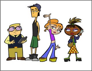
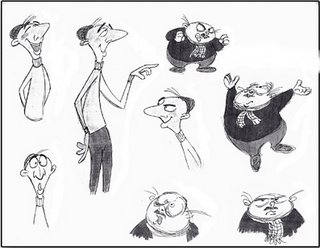
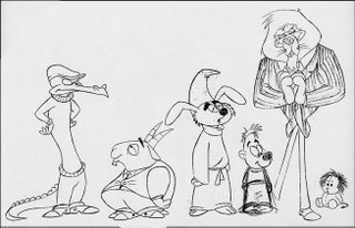
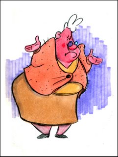
I have spotted this post with various designs I have done but either the pitch didn't get picked up or I never used them.


2 Comments:
good theory's on design.
If you ask me, a low budget may mean limited animation but limited animation doesnt mean bad design.
Exactly. What does seem to happen though is we see bad design because studios think it's different or "edgy" (a word which came about in the 90's when execs didn't know how to describe what they wanted). Some of the more designy styles came about with limited animtation such as UPA.
Post a Comment
<< Home