That's a Fine Silhouette
 Silhouette is something you hear talked about a lot in animation circles. Many times how it applies to animation gets misinterpreted. Often animators think it means to be sure arms and legs need to be put out to the side in order to get a good silhouette. I call this a “flat” silhouette. Although that does work and should be looked for it can become boring and can cause your animation to lose it’s dimensionality. To get a good silhouette might mean you need to utilize certain aspects of your characters design. For example if they have a large torso area, placing the hand in front of that area could make it easy to read.
It is most important to have good silhouette in your final pose of an action. This means that the inbetween poses might be weaker in their silhouette but as long as the over all action can be read this is okay.
Another area animators tend to forget is to not only make sure the overall pose works in silhouette but individual parts of the character need to read. Hands, arms, legs, feet, heads, etc need to have good silhouette on their own.
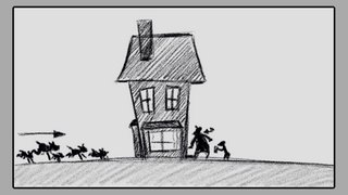
 I am starting a new scene on my film that is the ultimate type of silhouette. In this scene the characters are solid color so the action needs to read well. In these types of cases it is often good to blatantly pose the characters in a flat silhouette.
When storyboarding a film you need to be careful when planning these types of scenes so by the time they get to animation the action isn’t going to get lost. Certain cheats can be used in cases like this. For example in my scene I have gotten rid of all extraneous objects around the house in the background. If you use silhouettes in a shadowy setting, place a solid area of color behind where the character will be to help them read. Perhaps a pool of light or a solid wall.


0 Comments:
Post a Comment
<< Home